AIR VISITS SITE REDESIGN
Air Visits is a tele health company that provides tele health services to patients after discharge, as well as ongoing health services for clinics.
UX RESEARCH | UI DESIGN | FINAL SITE


WORDPRESS
FIGMA
PHOTOSHOP
CLIENT REVIEW
Working with Kevin was an incredible experience. Their professionalism was well paired with their ability to problem solve for many aspects required for my company’s site redesign. I am very pleased with the way that the Air Visits’ site turned out and will definitely be recommending Kevin to anyone who needs help in the future.
– Alex Fahrenbach, Air Visits CTO
HOW IT STARTED
The client started out explaining their struggle with getting a website that they liked and they could maintain properly. Our first meeting started with a lot of what not to do, then shifted to what we can improve. This was a great journey to go on together and I learned a lot about WordPress along the way.

ORIGINAL WEBSITE
- Broken links
- Not responsive
- Overlapping icons on text
- Bland color palette
- Little use of pictures
- Text heavy
- Font inconsistencies
UX RESEARCH
To improve user flow, I created user personas based on their most important client: hospital staff. Next I completed a competitor analysis to see what others in the field were doing for their websites. I checked on other tele health companies, as well as healthcare companies in general.
Current trends I noticed:
- Heavy photo use
- Lots of negative space
- White backgrounds and one bold accent
- Putting information into blocks
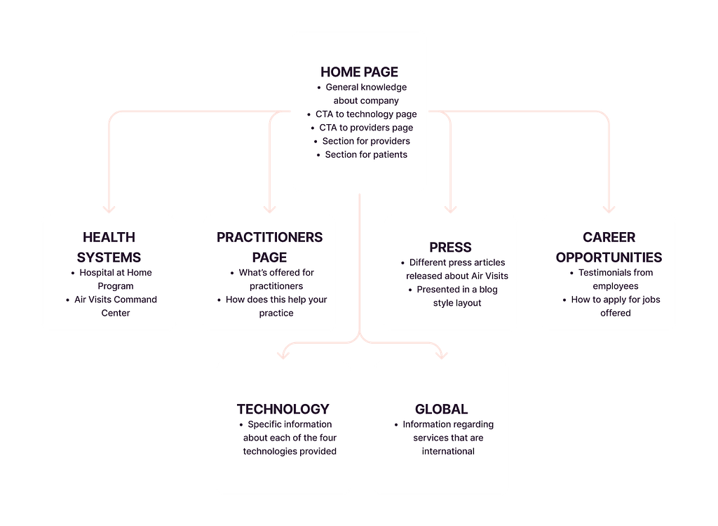
Then I created a basic site map which was based on the idea that most users will want general knowledge about the company, as well as learn more about the different technology and services offered.


UX IMPROVEMENT GOALS
- Make information more digestible
- Create strong and consistent call to actions
- Add a contact us CTA in the navigation bar
- Fix overlapping icons
- Make website fully responsive
- Update all links
UI IMPROVEMENT GOALS
- Standardize font weights and sizes
- Modernize color palette
- Update icons
- Add additional images for visual cues
- Change buttons to provide attention
- Make everything visually pleasing

WIREFRAME
I created a basic wireframe and style guide to present to the client for initial feedback. The client provided feedback on grouping information in a different way for the Practitioner’s page, as well as adding in more copy on the Home Page.
Next we discussed the overall aesthetic. The client wanted to provide a clean, professional look, and stick with a minimal color palette. Their logo was staying the same, so he mentioned wanting the colors to be cohesive with the blue and white in it. All images and icons were to be used from already licensed Adobe stock photos.
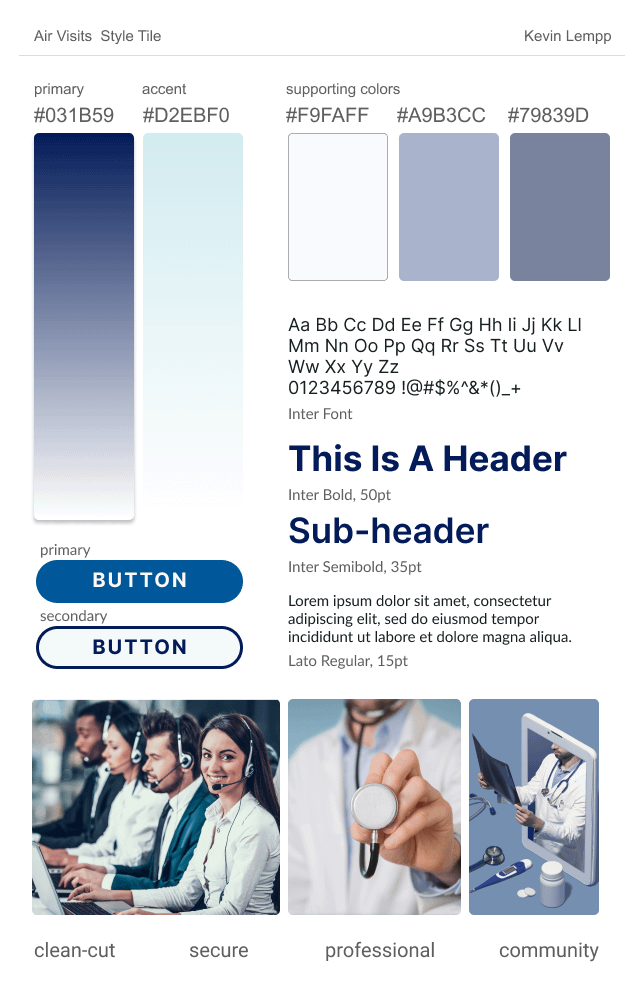
STYLE GUIDE
I created some variations of darker and lighter blues based on their current one. Often blue signifies business, as well as medical, so it was a win-win. I chose to use Google fonts in order to decrease hassle of having to upload fonts or add additional cost as well.

SCHEMATIC
Next step: combine the two. I turned the wireframe originally built into a prototype schematic design. This way the client had the real feel for the website. At this point, I received feedback which did change the end result for the better. After some more iterations and fixing a few more edits, it was time to build out the website.
USER TESTING
Once I had a final draft complete for my website, I had to ensure that there weren’t any further issues before handing it off to my client. For this I completed some user testing, where I asked five people to go through the website. They clicked on everything possible, as well as went through some basic user flow tasks to complete that I suggested. The testing allowed us to find more issues to fix, which lead us to to the final version of the site.
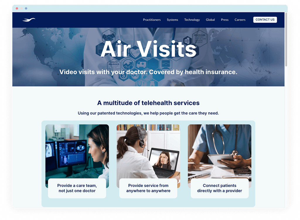
FINAL SITE
The final site was built in WordPress using Astra Theme, without the use of any additional builder plug-ins, per my client’s request. For some items I added in custom CSS to create the look we both wanted. On top of the built-in elements, I did add in an embedded contact form, per client’s request. Altogether, including every step of UX research, the entire website took me about 40 hours to finish. I’m very grateful for this opportunity to have worked with a great client and provide them with a website they were very happy with.