HUMANS HAVE TAKEN OVER
Museum exhibit design concept for The Vegan Museum
OVERVIEW | UX RESEARCH | UI DESIGN | PROTOTYPE

ILLUSTRATOR
PHOTOSHOP
ADOBE XD
FIGMA
WHAT IT’S ABOUT
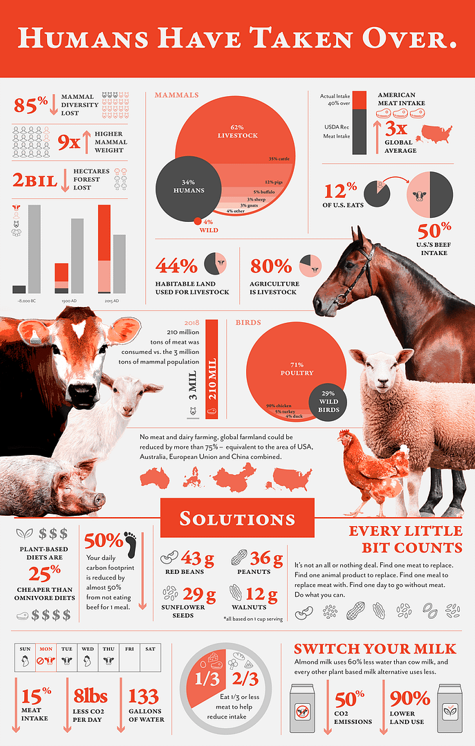
This all started with learning that only 4% of the world’s mammal population is wild. The rest are livestock and humans. After I learned that, I needed to know more, and I started spiral into some devastating, yet interesting, research.
I created the infographic first, which then morphed into a full experiential design museum exhibit. I call it “Humans Have Taken Over”.

ORIGINAL DESIGN
The original design used a bold red-orange, as well as grays, and various tints and shades of each. This was prior to establishing this within the brand guidelines for The Vegan Museum, which uses very different colors.


USER PERSONAS
I created user personas to better inform my decisions of how to set up the museum exhibit. I found some essentials and similarities.
- Items to engage with
- Text and visuals to increase comprehension
- Area intended more for kids
- Enough room to separate visitors from each other
USER FLOWS
Based off of the personas, I created user flows for each individual to better understand how to create the kiosk interaction and other exhibit items. I had some takeaways from this which included:
- Need for some separation of interactive area and reading area
- Have every part of the exhibit in sight from every other part for parents
- Include visuals as well as paragraphs to help people’s comprehension
- Have a general flow which can be done out of order as well
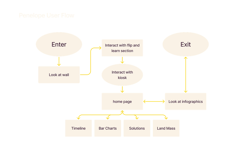
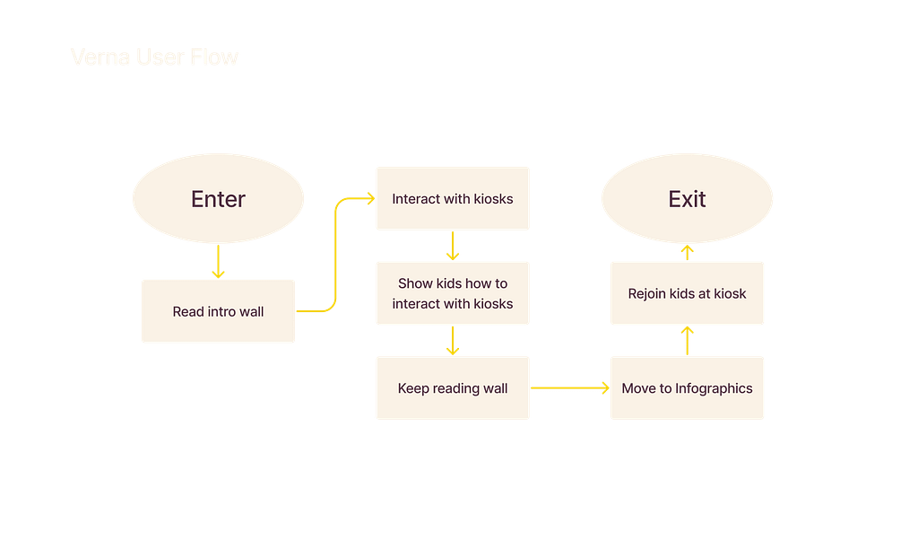
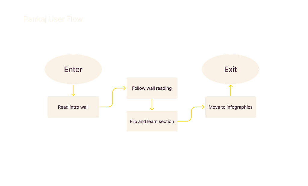
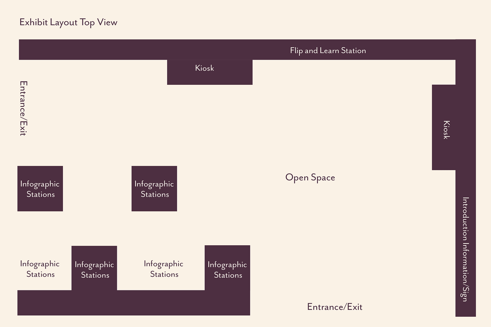
EXHIBIT LAYOUT
After creating user personas and user flows, I established an exhibit layout to show where each component would go. The flow should work both ways, for visitors to exit or enter from either way.
This layout allows for space between the interactive portion, as well as the informative section. This would help people who are trying to focus on reading have some space and quiet to do so.
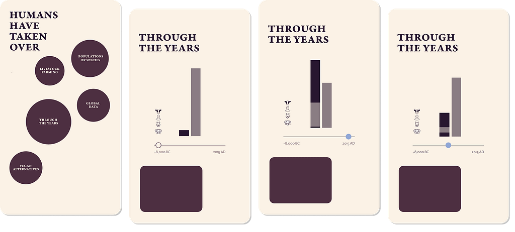
WIREFRAME
Based off of my findings I created a quick wireframe for the app screens which I would be using for the basic prototype. This would entail a home page, which the user would click into one of the five options. The option I chose to flush out was a slider bar graph which showed the changes in mammal and tree populations over time. Since this is more of a conceptual design, I did not flush out each individual screen.
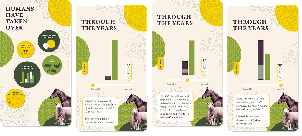
STYLE GUIDE
This style guide was created in order to ensure that each component of the app would be cohesive. The colors are in accordance with the branding of The Vegan Museum. The typography used is specific to this exhibit and does stray from their typography, however doesn’t become too individualized that it can’t be integrated. I also included buttons for the kiosk screens, as well as textures to be used for the architectural components, as well as screens.

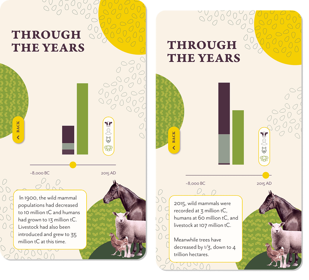
PROTOTYPE DEMO
This demo shows one user flow through the interactive kiosk screen. Since this is a prototype, it gives the feeling of what the actual transitions would look like. The idea is to be able to show the changes in mammal and tree population through time, by manipulating the slider component. This provides a fully visual representation, as well as some additional text to provide more accurate numbers.

FIGMA PROTOTYPE
Click below to try out the prototype created in Figma. The original designs were created in XD. However, by using transparent blocks on top of buttons, I was able to prototype it in Figma.